


Scoring 2026 FIFA World Cup Posters: Good and Bad of the Hosts
As the 2026 FIFA World Cup looms on the horizon, the excitement is no longer reserved for the pitch alone. Each and every one of the 16 host cities across the United States, Canada, and Mexico have published their official poster — a graphic expression of local pride, culture, and spirit of the world of football. While many of them are truly stunning, some clearly lead the pack among the rest, and some have let fans down.
Here's a summary of the best, the worst, and those that fall somewhere in between.


---
Top Tier: The Best Posters
Houston, Texas
Houston's poster is symbolic and creative. With an astronaut booting soccer, it's a nod to the city's historic success in space travel. An orange and blue reflection stands for local sports teams, and a reflection of the World Cup trophy inside an astronaut helmet is sheer brilliance. It's contemporary, bold, and full of character.
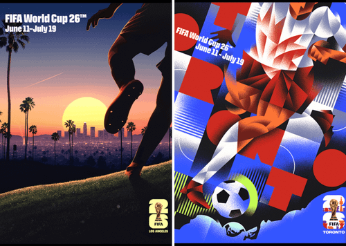
Los Angeles, California
Los Angeles offered a stunning mix of collage, computer painting, and illustration. The painting captures the dynamism, multicultural energy, and Hollywood glamour creativity of the city. The fusion of styles provides a poster that thumps with energy, accurately capturing L.A.'s vibrant cultural life and enthusiasm for the game.
Atlanta, Georgia
Atlanta's poster makes use of a golden soccer ball surrounded by slices of peaches — a clever reference to the state's best-known fruit. The painting is underpinned by a stylized crowd and includes veiled references to such landmarks as the Georgia State Capitol and MARTA. The use of bold color and symbolism makes it both pleasing to the eye and strongly rooted in local identity.
Seattle, Washington
Seattle took on its Pacific Northwest identity with a beautifully depicted orca breaching over a soccer ball. The dark blues and greens evoke the region's natural surroundings, and the orca, a regional favorite, adds a regal touch. It is minimalist but highly effective.
Boston, Massachusetts
Boston's poster is all about old-timey charm. With landmarks like the Public Garden and references to the Boston Tea Party, the aesthetic is lighthearted and full of Easter eggs. It's a layered work that demands close scrutiny and gives a good sense of place.
---
Middle of the Pack: Solid but Forgettable
Philadelphia, Pennsylvania
Philly's design features a blue field with soccer balls on yellow lines and an overlay map-like image of the city. While it includes key landmarks and references to the city's Revolutionary past, the overall composition is messy. Nice idea, but lacks the artistic punch of the best designs.
Miami, Florida
Miami’s poster uses bright pastels and beach imagery, incorporating flamingos and palm trees. While it’s aesthetically fun and representative of the city’s vibe, some feel it veers too close to a tourism ad rather than an event of global magnitude. Still, it captures Miami’s laid-back flair.
---
Bottom of the Table: The Weakest Designs
Dallas, Texas
Dallas's poster has been accused of being generic. With its big red star and sparse background imagery, it's more Texas-themed logo than dynamic football celebration. It is lacking in depth and imagination and is therefore forgettable compared to more creative entries.
Kansas City, Missouri
Kansas City's design is uncharacteristic of the excitement of the World Cup. While it has references to jazz and barbecue, the design is too bland and lacks the élan that comes with hosting a world event. It is dull and uninspired.
---
Conclusion
The 2026 FIFA World Cup posters provide a fascinating window into what each host city imagines itself to be on the world stage. The best posters find local identity combined with creative celebration of the game. Others fail by being unsafe, too busy, or thematically inconsistent. As more cities finalize and reveal their artwork, these posters will continue to shape the visual story of what is shaping up to be an unforgettable tournament.
No comments yet
Be the first to share your thoughts!