


Android is one of the most popular operating systems in the world, and one of the reasons for this is its commitment to accessibility. Google has continuously worked to develop features like Guided Frame and settings for hearing devices to make Android more accessible. In Android 14, Google may be introducing another accessibility feature that will make high-contrast text even more legible when dynamic theming is enabled.
Android's dynamic Material You theming engine uses colors from a user's wallpaper to stylize app interfaces, including buttons and backgrounds, to create a cohesive look for the OS. This theming engine, codenamed Monet, already accounts for color contrast issues when creating these dynamic palettes, ensuring that the readability remains good. However, prolific Android researcher Mishaal Rahman has discovered evidence suggesting that Monet will soon tweak palette colors further for when the High contrast text toggle is enabled.

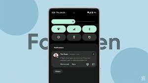
The High contrast text setting is located under Settings > Display > Display size and text > High contrast text. When enabled on Android 13, the text defaults to white with a black outline/background or black color with a white outline. This setting overrides the dynamic theming color assigned to UI text, making it easier to read.
Rahman explains that Android 14 adds a new feature that automatically uses a different method to calculate which Material You colors to show when someone enables high-contrast text. This works via a "dynamic" fabricated runtime resource overlay (FRRO) that replaces or remaps standard Material You colors with some that offer even better contrast. Google has uploaded a full list of these mappings to the Android developer website. A recent commit to the Material Components library confirms Google wants the new color mappings to help Monet handle high-contrast text better, without sacrificing dynamic theming.
For app developers, this change is unlikely to have any significant impact, as it is mostly a system-level change that Android will implement automatically. However, developers are advised to check the list of mapped colors to ensure the changes do not inadvertently affect their app interfaces.
At present, there is no confirmation from Google about this change, and it is unclear whether this accessibility feature will be available in the stable version of Android 14 later this year. If implemented, Android OS could use dynamic theming consistently without discoloring the UI to aid accessibility. Although the Android 14 Developer Preview is available for installation, this new color mapping system is not yet live.
In conclusion, Android's commitment to accessibility is commendable, and the addition of this new feature will make high-contrast text even more legible when dynamic theming is enabled. Google's focus on accessibility features like this highlights the company's commitment to ensuring that everyone can use Android devices easily and comfortably. With Android 14 set to arrive later this year, users can look forward to even more improvements in accessibility.
No comments yet
Be the first to share your thoughts!